ILLUSTRATOR | INDESIGN | PHOTOSHOP | LIGHTROOM | SQUARESPACE 7.1
Brand Identity & Web Design
About:
CentreCore Contracting has over 40 years of combined experience in all sectors of construction and project management. They provide services to a variety of industries across Ontario including residential, commercial, industrial, and institutional sectors. Their mission is to unite passionate and diverse professionals and innovate spaces to give back to their community by delivering a rewarding construction experience.
Keywords:
Modern, Bold, Professional, Sleak, High-end, Quality, Masculine
The Project:
Brand Strategy, Brand Design, Custom Squarespace Website, Copywriting, Stationary
Website: www.centrecorecontracting.com
The Challenge:
The challenge was to create a brand identity that effectively communicates CentreCore Contracting’s mission of giving back to their community through innovation, unity, and collaboration. Specifically, visually representing togetherness, from the seamless coordination with their subcontractors to the collaborative approach with their clients.
The Solution:
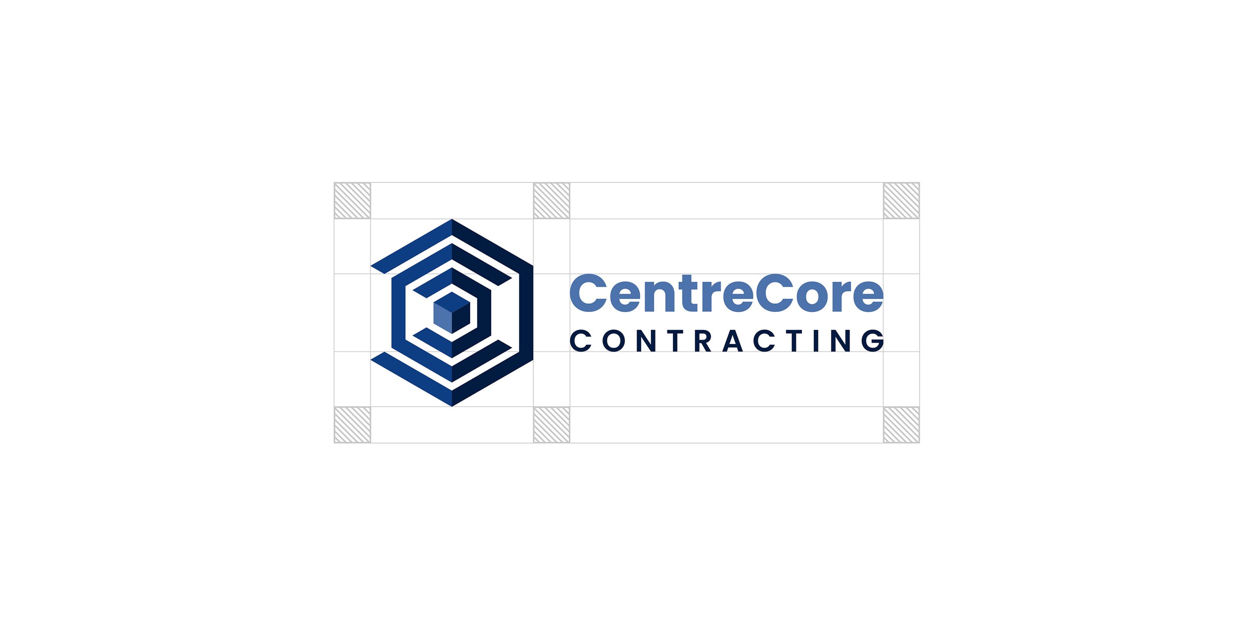
To solve this challenge, the final logo features three architectural “C” elements nested together, symbolizing the interconnectedness and synergy between the company, its subcontractors, and its clients. At the core of this design sits a cube or building block, symbolizing the solid foundation on which the company stands, enabling its continuous growth, expansion and meaningful contributions to the community through its construction endeavors.
Blue Color Palette:
Blue is often associated with trust, reliability, and stability. The goal was to evoke a sense of confidence in the company's ability to execute quality construction projects. In addition, dark blue tones can help convey a sense of professionalism, competence, and expertise, positioning it as a trusted authority in its industry.The incorporation of three shades of blue in the logo design adds depth and dimension, vividly bringing it to life. This visual effect not only enhances the aesthetics but also subtly evokes associations with construction and architecture.
Clean Lines and Modern Typeface:
The use of clean lines and a modern typeface in the logo design conveys professionalism and forward-thinking, aligning with the company's ethos of delivering a rewarding construction experience and their commitment to staying at the forefront of the industry.
Transparency:
When placing the logo on a photograph or a dark background, use the white transparency logo at the designated opacity percentages for placement on dark or busy backgrounds, ensuring it stands out without overwhelming the image.


